OK, so you’ve got got hold of a fancy new font, and you know there are all sorts of slick and swirly delights hiding within it. But when you try to use it, it all just looks a bit… well… plain. So how the heck do you make the most of these extra typographic features?
If you’ve read any of the font friday posts elsewhere on the blog you may have seen mention of OpenType, or references to using “OpenType-aware software”. OpenType fonts (.otf files) are the key to unlocking the extras buried within a font, since they allow type designers to bundle additional characters and features in the typeface, along with a set of rules on when to show them.
Not all OpenType fonts are created equal of course – the extra time and effort needed to make these fonts generally mean you’re unlikely to find advanced type features in most free fonts. And even then, not all paid fonts contain extra typographic features, although most font libraries (such as www.myfonts.com) will make it quite clear if they do.
There are some great free fonts out there though, such as the immaculately produced “Calendas Plus” from Atipo which is available to download for just the cost of a Tweet of Facebook Like from their website. Also, if you’ve installed any Adobe software in the past few years you’ll have had a few feature-packed fonts automatically added to your system. Keep an eye out for any with the word “Pro” in their name – this is usually a dead giveaway that they’ve got some interesting extras hiding underneath the hood.
The most common of these extras are ligatures, where two or more letters are combined into a single shape. Chances are you’ve used one of these several times already this week without even realising it…
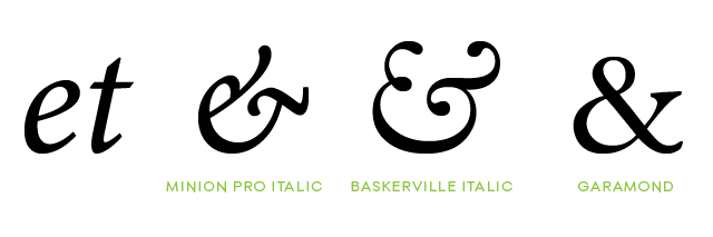
The ampersand is a ligature originating from the latin “et”. You can still clearly see the original letters in the ampersands of some fonts, but over time this shape has become abstracted and simplified into the more common “&” shape.
The ampersand originated from hand-written script, and has become commonplace enough to earn its own place on our keyboards. To discover most other advanced type features however, we need to dig a little deeper. This is where we need our OpenType-aware software, as not all software supports these extra features. The list of apps is unfortunately fairly limited, although many will have a copy of Adobe Photoshop, Illustrator or InDesign installed, all of which support OpenType. Oddly, Photoshop Elements still doesn’t have OpenType options. Boo… For anyone who doesn’t have access to Adobe’s professional software, Microsoft Word may fill the gap. Users since 2010 have had access to an “Advanced” font panel with all the extra type features you need.
Photoshop’s OpenType options are available from the Character palette menu:

Illustrator has a dedicated OpenType palette:

Word gives users access to advanced type options through its font panel:

Ligatures in action
So we’ve got hold of some sort of OpenType-friendly software, and selected our font of choice. Lets see how things actually work in practice. (N.B I’m using Calendas Plus here as mentioned above – other fonts may handle their ligatures slightly differently).
It’s handy to have a test phrase when scrutinising fonts for Opentype features – one which contains the right combinations of characters to let the typeface best show off its wares. The phrase I tend to use is a nonsensical sentence, but it contains most of the letter pairings commonly combined in OpenType fonts. Let’s start by taking a look at how it looks without any extra type features activated…

At first glance it seems OK, but after looking at it a bit more closely there’s something annoying about that letter ‘f’. Lower-case ‘f’ has always been a problem for printers… It looms over the lower-case ‘t’, it squares up aggressively to stare out the ‘i’, it invades the personal space of the ‘l’, and just stands plain awkwardly next to its twin.
Problems with ‘f’, ‘l’, ‘t’ and the like were taken so much for granted in the past that most metal type was produced with ligatures for these as a matter of course, with single blocks or stamps containing a combined character that could used in place of the sets of letters. These common stand-in characters became referred to as “standard” ligatures. So lets try that phrase again with standard ligatures activated in our software:

The font has replaced these problem letter groups for the appropriate ligature – the ‘fi’ with a wider loop at the top of the ‘f’ to also provide a cap to the ‘i’, the ‘ft’ shares a common crossbar, the ‘ff’ now look like a much more comfortable pairing and the ‘fl’ are now linked at the top. Much neater.
Even iOS and Android have started to embrace standard ligatures, with the latest versions of each operating system making these substitutions automatically. This makes the type a lot more elegant, particularly on small screens where text can seem cramped at the best of times.
That’s standard ligatures then, but some fonts go a step further and have a secondary set of ‘discretionary’ ligatures. These tend to be more decorative in nature, and are intended to be used at your discretion… Hence the name. Activating discretionary ligatures on our sentence below gives the following:

Some discretionary ligatures combine frequently occurring letter pairs (like ‘ck’ or ‘st’) into a single elegant design. In some cases these reflect a historical usage, while in others the type designers are purely having a bit of typographic fun – you quite often see this in script fonts such as Cantoni Pro, where applying discretionary ligatures to the word ‘and’ replaces the characters with a much more ornate alternative.
I’ll be looking at some of these more creative type features in the next Type Tips post, including contextual alternates, titling alternates, and of course those swooping, swirling swashes.
Details
Fonts: Calendas Plus (Atipo) – Free download / Pay with a Tweet